How To Build a Landing Page that Converts?
- April 4 2016
- Ranjan
“Don’t judge a book by its cover” is a very common phrase but none really follows it. Books rarely sell if the cover page is not so impressive. Just like that, your website landing page is the first means to draw your viewers and get converted to leads. You have to be utmost careful in designing your website landing page.
Later in this blog, I will give specific tips on developing a page that will convert, with an illustration. But first, let’s break the hurdle that most people face when it’s time to develop a landing page.
No Design Experience required to design a landing page
Luckily for people like me, there is Learnyst Website Builder that will allow me to create a stylish looking landing page without having to spend a lot on getting landing page designed by the web designers.
Now, that you know you don’t have to be a professional web designer, what should you focus on to ensure that your landing page has the best chance of converting?
I’ve made a list of basics that every landing page should have, and I’ve also provided example of landing page.
Incorporate images
Our brain is naturally attracted to images, and can process pictures faster than text. A quality landing page will capitalize on the power of pictures. landing page should include large images that are relevant to the page. These pictures should also be high-quality images that use contrasting colors and light to draw the eye to them. Finally, be sure that your images are large. Large pictures have a major impact on visitors. In fact, you can incorporate your image into the background of the page, or use it as a canvas upon which your text is placed.
Include a great headline
Headlines are meant to draw people in, making them want to read more. Headlines need to be informative, but also interesting. Finding the right balance can be a chore, but you should have multiple headlines and test several headlines to find out which one resonates the best.
Explain your product
Your site has a purpose, and that purpose should be clear on your landing page. You know your product, but your visitors need some explanation. Your explanation should stay focused on the user. It is not enough to describe your product; your landing page should explain why this product matters to the user. The best way to do this is to focus on their pain points and how your product or service is going to help them.
landing page should do the job of walking the visitors through the features and value propositions with beautiful images and well-written copy.
What does your customer have to lose?
People are naturally inclined to avoid loss. They will purchase a product to avoid missing out or to prevent losses in efficiency. This loss aversion can and should be used to your advantage. A high-converting landing page will describe the loss that visitors will experience without your product. A landing page that helps users avoid loss will also draw people towards a purchasing decision.
Offer testimonials
Testimonials have a powerful impact on potential customers. Often when people are looking for a particular product or service they will ask their friends or read reviews.
Provide multiple ways to contact you
Now, if you follow these tips, your landing pages should take a giant leap forward and become the channel through which your sales grow.
But, before starting to build your website, you will first have to prepare a copy-write for your website. Keeping the above tips in mind start writing your copy of landing page.
You definitely need not stick to one stragegy in designing your website. There are number of successful stragegic formats you can adapt. copywrite. https://blog.bufferapp.com/copywriting-formulas
10 key points for a well written copy
- Goal of landing page
- Decide your landing page Sections
- Prepare Copy-write
- Optimize for SEO
- Create the sections
- Decide theme
- Search | Optimize | Insert suitable icons & images
- Optimize for SEO
- Verify website on Google page speed
- Add essential tools
Once you are ready with a copy write, Learnyst website builder helps you build the most professional landing page for your website. Refer the illustrated model of a Copywrite done for a dance school landing page on Learnyst.
You can refer the link – Copy Write of Model Website built on Learnyst Website Builder.
Once done with preparing the copy-write,
Login to Learnyst and go to site builder and start designing your landing page.
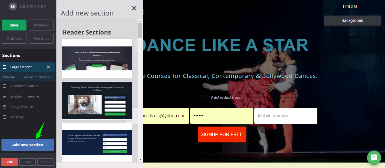
- Click on Add New Section button to add sections that you want to add to your landing page. You can add, edit, reposition your sections based on your needs. You can also hide or show them on the navbar of your website landing page.

There are four types of headers. Simple header, Video header, Signup header and large header. You can choose one based on what you are going to show in the header, a video or a picture or a signup form.
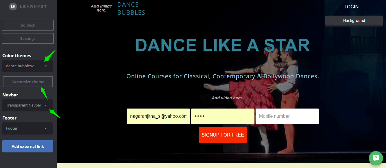
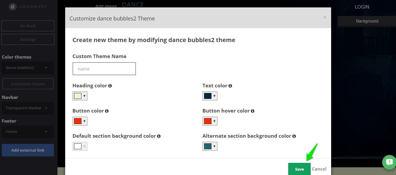
2. Learnyst offers you the customization of themes. You can click on customize theme to edit the features of the system themes and create a new theme of your own. You can also decide on the placement of the Nav bar.

After deciding on the colors you want to apply for your theme you can give it a name and click on save.

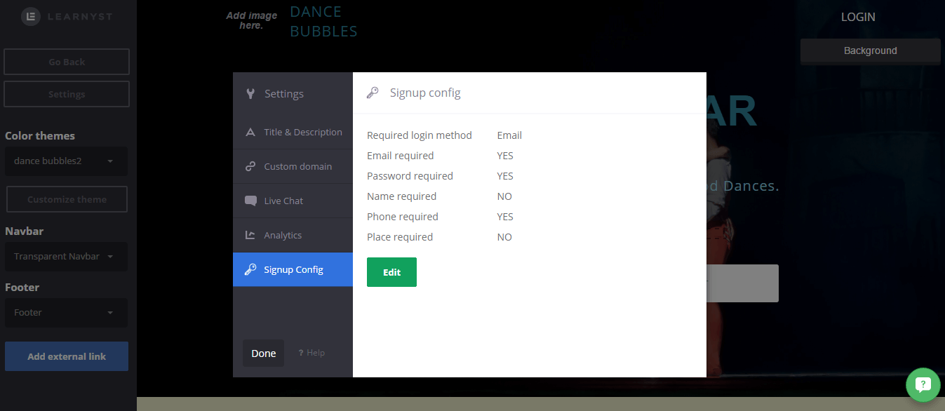
You can customize the signup header that you display on your website.

All learnyst image library images are optimized to speed up your website. You can check our blog on image optimization
Learnyst Website Designer’s Powerful section designs helps make your landing page most competitive one.


Leave your thought here